Drag

We don't just build the brands; we bring them to life.

print digital

Started from the bottom

Since we began designing brands in 2009, we have produced numerous designs that are in close agreement with our customers. We don’t believe we have to develop every brand; instead, we concentrate on how the brand will resonate with consumers. Because of this, the brands we develop are straightforward, memorable, and, as numerous customers have informed us, successful.

Simply Google www.noideas.in if you’re looking for brand ideas. We are constantly prepared to develop your brand.

What we do

print

Branding & Identity

Design for Print & Media

Environmental & Event Design

digital

Advertising & Digital Media

Creative Production

Web Services

Our works

SMILEY BEE
GULP JUICE BAR
MY FOODS

Clients talk

Trusted by the finest

Brand.
Design.
Strategy.
Digital.
Content.
Print.
Campaigns.
Marketing.
Ideas.
Concept.
Brand.
Design.
Strategy.
Digital.
Content.
Print.
Campaigns.
Marketing.
Ideas.
Concept.
Brand
SMILEY BEE
Deliverables
Logo design
The Challenge
Smiley Bee required a logo that would appeal to both children and parents, positioning the brand as fun, friendly, and trustworthy. The challenge was to design a character-based identity that balanced playfulness with professionalism—something instantly memorable, emotionally engaging, and scalable across packaging, social media, and merchandise without losing clarity or charm.
The Solution
We designed a cheerful and expressive bee mascot with a warm, welcoming smile—capturing the heart of the brand name visually. Rounded typography complemented the friendly nature of the icon, and a bright yellow-black color palette was used for maximum visibility and emotional appeal. The result was a versatile and vibrant logo that perfectly embodied the brand’s joyful personality while remaining adaptable across all brand touchpoints.
Brand
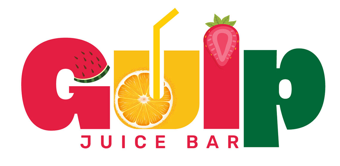
GUIP JUICE BAR
Deliverables
Logo design
Business card design
Menu card design
Wall design
The Challenge
GUIP Juice Bar needed a cohesive visual identity that could instantly reflect its fresh, energetic, and health-conscious brand philosophy. The goal was to create a logo, menu, packaging, and signage that not only stood out in a crowded market but also communicated freshness, vibrancy, and modernity. The challenge was to maintain consistency across all touchpoints—balancing a fun, youthful vibe with clean design and clear brand messaging to attract health-focused customers and passersby alike.
The Solution
We crafted a vibrant and refreshing identity for GUIP Juice Bar, beginning with a bold and energetic logo that conveys natural vitality through dynamic shapes and fruity color tones. The menu design followed suit, combining playful typography and bright visuals to make selections feel approachable and engaging. Packaging was designed to be both functional and eye-catching, using color-coded labels and ecofriendly materials that reinforced the brand’s commitment to freshness and sustainability. Finally, the signage was created with high visibility and minimalist clarity in mind, ensuring GUIP stood out in both urban and retail environments. Altogether, the visual system delivers a seamless brand experience that feels refreshing, natural, and full of energy.
Brand
MY FOODS
Deliverables
Package design
Logo design
The Challenge

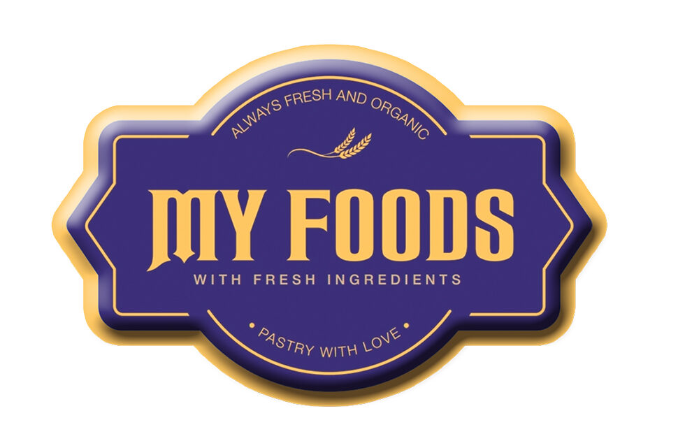
The primary challenge for the MY FOODS packaging design was to create a visual identity that reflects the brand’s promise of natural, traditional ingredients while still standing out on modern retail shelves The design needed to communicate freshness, trust, and authenticity in a crowded snack market, all while maintaining consistency with the brand’s existing values and appeal to a health-conscious audience.

The Solution
To address this, we crafted a packaging design that combined rich, inviting colors with bold typography and clean visuals. The use of deep blue conveys trust and tradition, while the bright accents and natural imagery highlight freshness and taste appeal. The logo was placed prominently to reinforce brand recall, and the phrase “100% Natural & Traditional” was featured as a key value proposition. Overall, the packaging strikes a balance between traditional essence and modern appeal—helping MY FOODS confidently connect with its target market.
Brand
ELLYPHAN
Deliverables
Logo design
Tag design
The Challenge

To design a modern, minimal, and iconic logo for the brand ELLYPHAN, which needed to represent the strength, intelligence, and elegance  associated with elephants — while remaining adaptable for sleek, high-end product  applications.

The Solution
To bring Ellyphant’s brand vision to life, we designed a bold, modern logo that combines simplicity with symbolic strength. The abstract elephant form, created using clean, minimal shapes, conveys intelligence, reliability, and memorability—all essential traits for a contemporary brand. The striking red color evokes energy and confidence, while the smooth curves soften the overall look, making the identity approachable yet distinctive. Paired with a sleek, custom typeface, the logo captures the essence of Ellyphant’s name and purpose—clever, impactful, and unmistakably unique.
Brand
YUMMY POP
Deliverables
Package design
Logo design
The Challenge

To create a fun, flavor-forward brand identity for a new popcorn brand targeting cinema-goers and snack lovers. The packaging needed to be vibrant, memorable, and instantly recognizable on the shelf or in-hand at movie theaters.

The Solution
For “Yummy Pop,” we crafted a playful and energetic brand identity that instantly appeals to a younger audience and snack lovers. The logo combines bold, fun typography with vibrant colors to reflect the excitement and joy of snacking. The packaging design features dynamic graphics and appetizing visuals, ensuring strong shelf appeal and instant recognition. Altogether, the visual language captures the essence of a fun, flavorful, and on-the-go treat, helping the brand stand out in a competitive snack market.
Brand
OSS MUSEUM
Deliverables
Digital Illustrations
The Challenge
Capturing the intricate architectural details of the OSS Museum in a vector format posed a significant creative challenge. The building’s historical features—including ornate carvings, layered brickwork, and complex roof structures—required a high degree of accuracy and artistic interpretation. Striking the right balance between visual fidelity and clean, scalable vector design was crucial to ensure both authenticity and usability across various mediums
The Solution
The solution involved a meticulous vector illustration process, starting with photo referencing and careful layering of architectural elements to maintain structural integrity. Using clean lines, refined color palettes, and consistent shading techniques, the final artwork effectively translated the museum’s heritage into a modern digital format. This illustration not only preserves the identity of the OSS Museum but also serves as a versatile asset for educational, promotional, and branding applications.
Brand
TOKYO
Deliverables
Logo design
The Challenge

Design a dynamic, modern logo for a Tokyo-based cycling event or brand — one that captures speed, energy, and movement while staying visually clean and impactful.

The Solution
For the “TOKYO” logo, we developed a dynamic and energetic identity that visually captures the spirit of speed, motion, and athleticism. By integrating the cyclist silhouette into the typography—where the bicycle wheels form part of the word—the logo becomes both literal and symbolic. The sharp lines, bold red tones, and motion trails evoke a sense of velocity and determination, making the brand instantly recognizable and aligned with sporting and active lifestyle themes
Brand
PAARAMBARIYA SAMAYAL
Deliverables
Logo design
Package design
The Challenge

Create an authentic and culturally rooted brand identity for “Paarambariya Samayal”, a traditional South Indian food brand. The goal was to visually communicate the brand’s core values — heritage, purity, and home-style taste — across its logo and packaging, while appealing to modern consumers.

The Solution
To capture the rich essence of “PAARAMBARIYA SAMAYAL”, we developed a logo and packaging system that visually represent the brand’s commitment to traditional South Indian cooking. The logo design reflects heritage and authenticity through culturally inspired typography and symbolic elements that resonate with native roots. Complementing the identity, the packaging design uses earthy colors, traditional patterns, and clean layouts to create an inviting and trustworthy presence on the shelf. Together, the logo and packaging form a unified brand language that honors culinary tradition while remaining appealing to modern consumers.
Brand
BLUE WAVE
Deliverables
Advertising
The Challenge
Blue Wave, a brand aiming to stand out in a saturated advertising space, needed a visual identity and campaign style that reflected clarity, freshness, and movement—true to its name. The challenge was to create a dynamic advertising concept that communicated brand values across diverse platforms while remaining cohesive, modern, and impactful. It required a strategy that balanced creativity with consistency, ensuring strong recall in both digital and print formats.
The Solution
We crafted a bold and fluid visual language inspired by the natural motion and color tones of water. Clean typography, gradient waves, and a striking blue palette formed the core of the design system. Each advertisement was built to flow seamlessly—whether on billboards, social media—reinforcing brand recognition. The result was a vibrant and unified ad campaign that gave Blue Wave a distinct presence and voice, successfully resonating with its target audience.
Brand
DASH CAT
Deliverables
Logo design
The Challenge

Design a striking and minimal visual identity for a brand named “-cat” (Dash Cat) — a name open to creative interpretation. The challenge was to communicate the essence of the brand (possibly playful, mysterious, and modern) using limited colors and simple forms.

The Solution

We developed a black & white logo system that is both abstract and memorable, featuring a stylized, curled-up cat that also forms the letter “C” — playing on the visual pun of the dash and the brand name “-cat”.

Brand
WE GET NATURE
Deliverables
Package design
Logo design
The Challenge

To build a fresh, trustworthy, and regionally rooted natural care brand that resonates with urban and rural audiences alike. The packaging had to stand out on shelves, feel naturally inspired, and reflect both modern appeal and traditional trust — particularly for the hibiscus-based shampoo product.

The Solution

We crafted a distinctive brand and packaging system for WE GET NATURE that merges modern design sensibilities with cultural authenticity. The logo layout and bold sans-serif typography establish a clean, confident identity that stands out on shelves while conveying trust and clarity. The inclusion of the regional “Namma Ooru Brand” tag grounds the product in local pride, making it both relatable and market-ready.

×